One of the questions I keep getting asked in interviews is when I design, if I design theme first or mechanic first. Honestly, I’ve always considered a game a real design when it has both theme and mechanic, so I guess I’m more of a story first designer (how does the mechanic work with the theme?), if I had to choose based on those.
However, the more games I design, the more I discover alternate ways to design games. Here’s a few of those ways that I really like!
Component First Designs
Since I’m also a publisher, I know a lot about the effect of components on the end price of a game. With that knowledge, I’ve designed some games purely components first. Like, I wanted to make a small, really cheap game with minimal components, so I limited myself to 18 cards and up to 10 dice. 18 cards can be cheap to print, depending on the printer and if you’re doing poker sized cards. (Some manufacturers print 27 or 54 cards at a time, instead of 18. )
Palette First Design

One way I’ve recently been designing games is deciding on the color palette first! If you go to websites like https://colorhunt.co/, you can see a lot of different color palettes. Choose one, and that’s the palette for your game!
Now, you have to think about the theme; what theme would go with that color palette? Or you can think of it as certain part of the game; for instance, what would the game be if these were the resource types?
This is similar to theme first design, but it can get you to go to themes you wouldn’t normally choose and get you thinking in a particular direction.
Palette AND Component Based Design
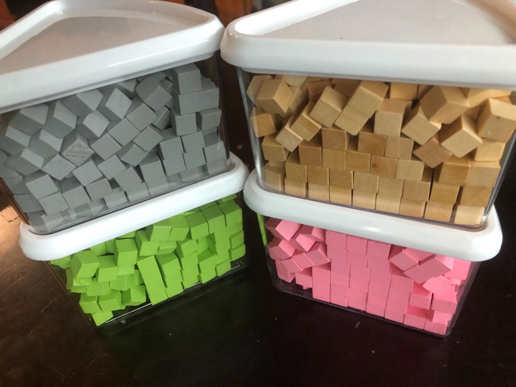
You can also combine the two types of design to be more restrictive! Here’s an example… I ordered a bunch of 12 mm cubes for another purpose and sorted all of the cubes out that I didn’t need to get these containers of cubes.

Now, these are a certain color palette in a set of components. When I started thinking about what kind of game this could be, my thought was Ice Cream; somehow you’re getting the four different ice cream flavors and stacking them up as a cone (as the cubes are big enough that stacking is easy). This is an idea that I wouldn’t have thought up on my own, but it’s as good of a use as any for extra components I had lying around!
Box Size Constrained Designs
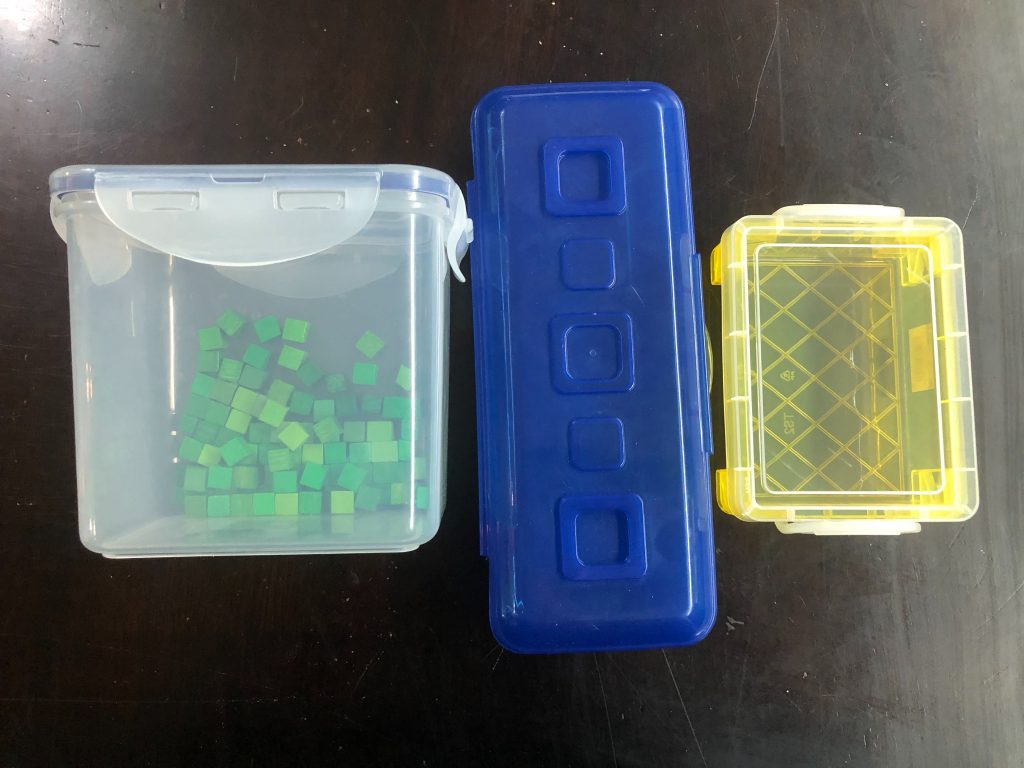
Another type of design that I mix with the other types is adding on a size constraint, usually the box size. All the components have to be able to fit in the box AND take up a good portion of the space. I usually do this for either small boxes or medium sized boxes. Here’s a few that I’ve used to help constrain the amount of components for a design.

The above are a small tupperware, pencil case, and crayon case. Both the pencil case and crayon case conveniently fit poker cards, so they make it super easy to carry around small games. You can design any game with this type of design, but it must completely fit in the box!
These are some of the ways that I’ve used to push myself to design outside the box (or specifically inside the box for the box size constaint!). What methods do you have to push your designs in different directions?